SMART DELAY
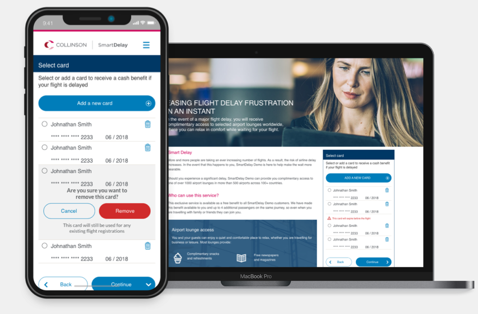
Smart delay is an award winning B to B to C air-travel assistance product of Collinson designed to give users stress free airport experience. User can register for the service online and receive free access to lounge or refreshment voucher in case of flight delays and disruptions.
THE CHALLENGEDefine the Product
At the onset, it was important to understand the product offering and the business requirements and clearly define the design objectives. Developing a mobile app supported by a responsive website was the initial business plan. Building a flight registration widget was suggested by the design team.
Primary goals
Simple and easy steps to avail the service
User experience consistent across all devices
Registration widget which can be easily themed
Mobile first approach
Design a scalable and flexible user journey
APPROACHUX design Strategy
UX and design strategy was defined at the start of the product development stage. This was a new product and user research was essential to understand user expectations. This would lead to ideation followed by initial prototype and final design with user testing at every stage.
My role
Senior UX Architect and Designer, managing the UX deliverables working alongside product development team.
Softwares
Sketch (with Abstract ) Invision for prototyping, Figma, Adobe XD - Photoshop, Pen & paper, Axure for initial interactive prototype
DISCOVERYUnderstanding user needs
Both quantitive and qualitative research was conducted to understand user needs.
Quantitive research
An online survey was conducted where 350 participants were asked questions related to airport experience. The responses from the survey showed 73% of participants had experienced flight delay of which 64% had faced a delay of more than an hour. The results also showed 64% said they nobody looked after them when they faced flight delays or travel disruptions.
Qualitative research
I also conducted a qualitative research with 3 user to understand their expectations and pain points related to airport experience. I found all passengers expect to spend minimum amount of time at the airport. Passengers traveling for work also want to have internet access and a place where they can sit and get some work done. Two focus group sessions, one with holiday makers and other with work related travellers, was also conducted to understand airport experiences of each group.
User Persona
With the information I acquired from the qualitative research I created a user persona. This helped the design team as well as the wider team understand user’s travel habits, and expectations from the product.
Experience Map
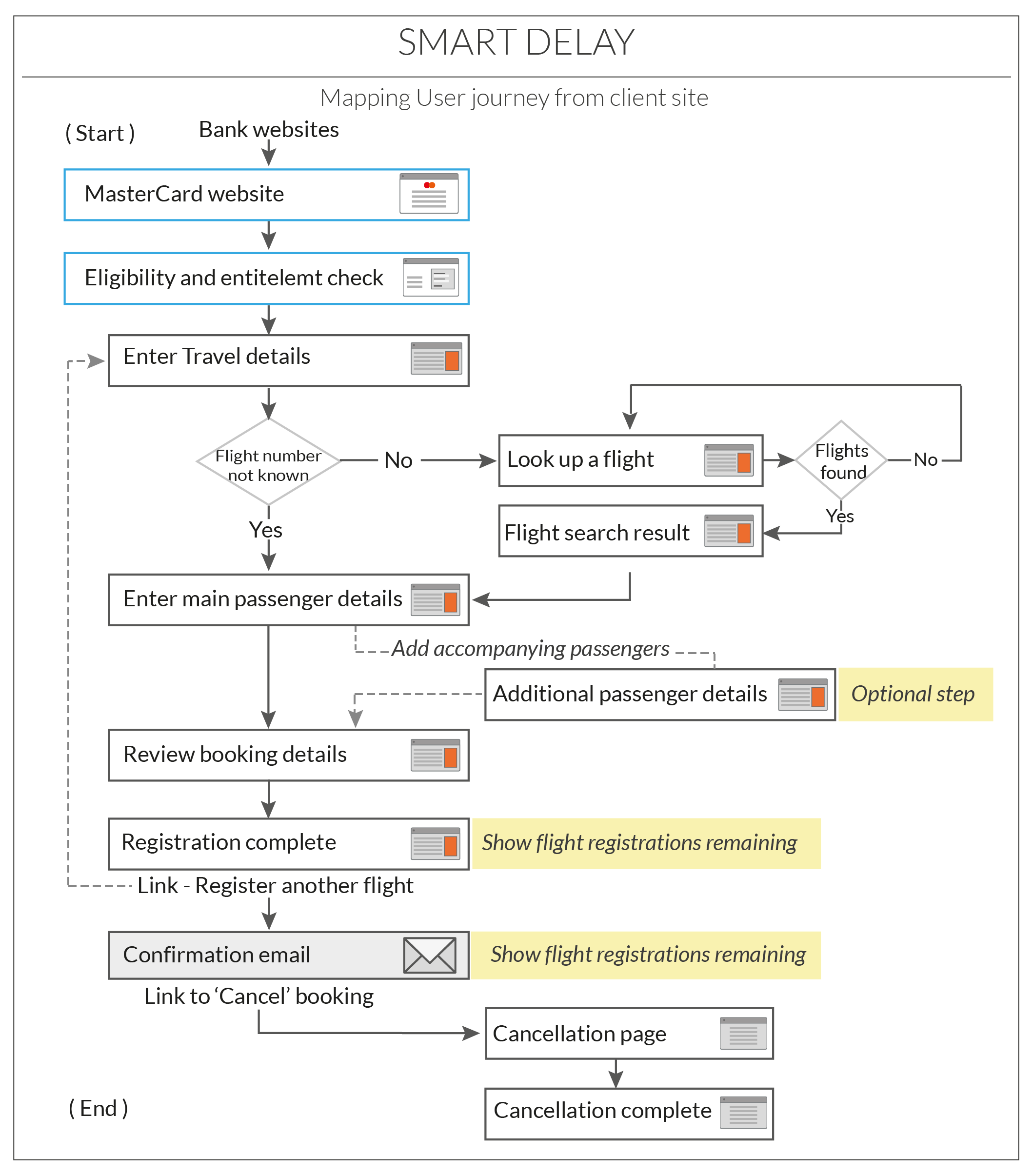
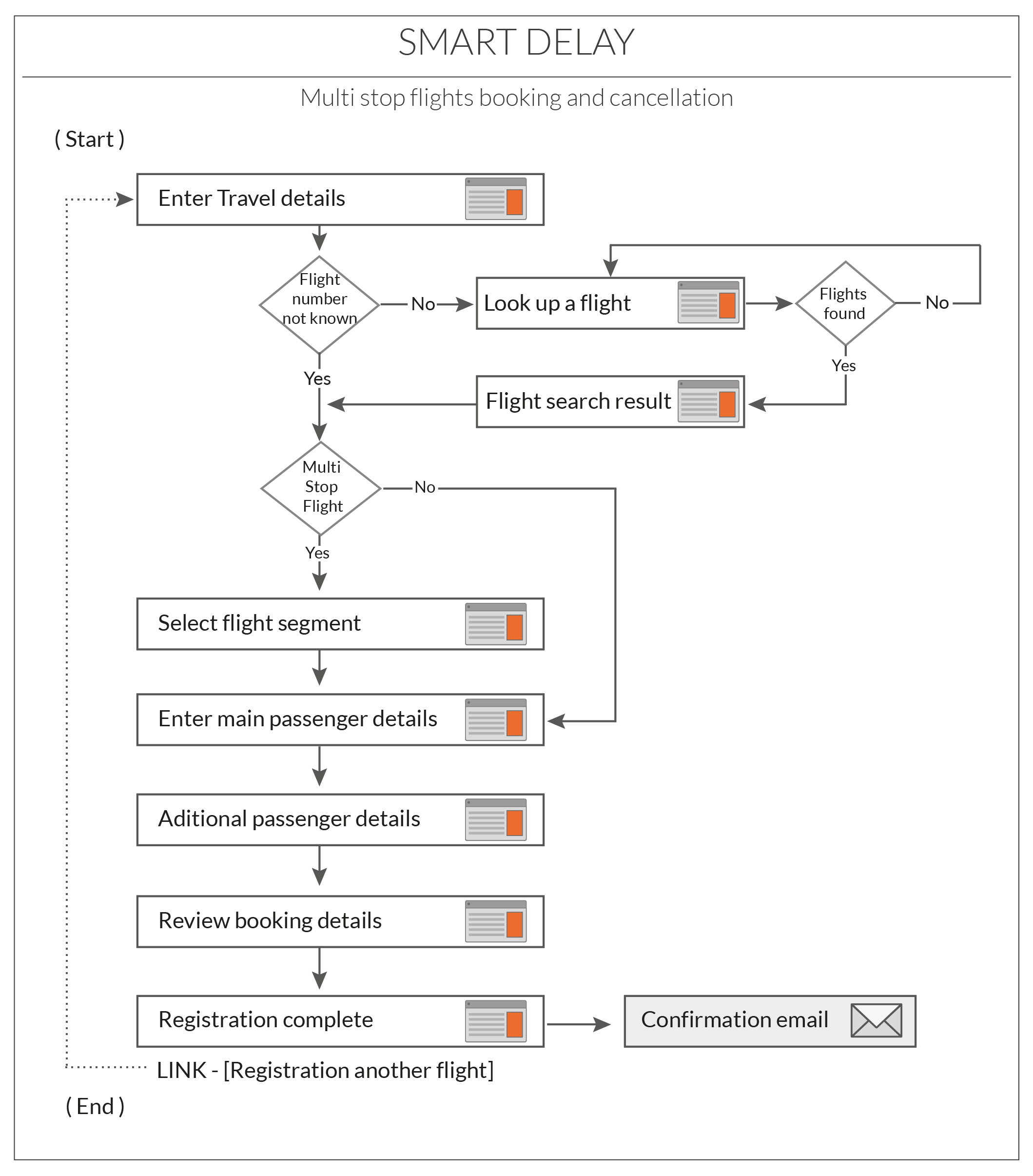
Journey mapping exercise followed the creation of the user persona to focus on the users’ interaction with the product, the different touch points and channels through through which user engages with the product. It helped the UX team ensure the user received the required information at the correct time and in usable format.
DEFINEJourney maps, prototype & Wireframes
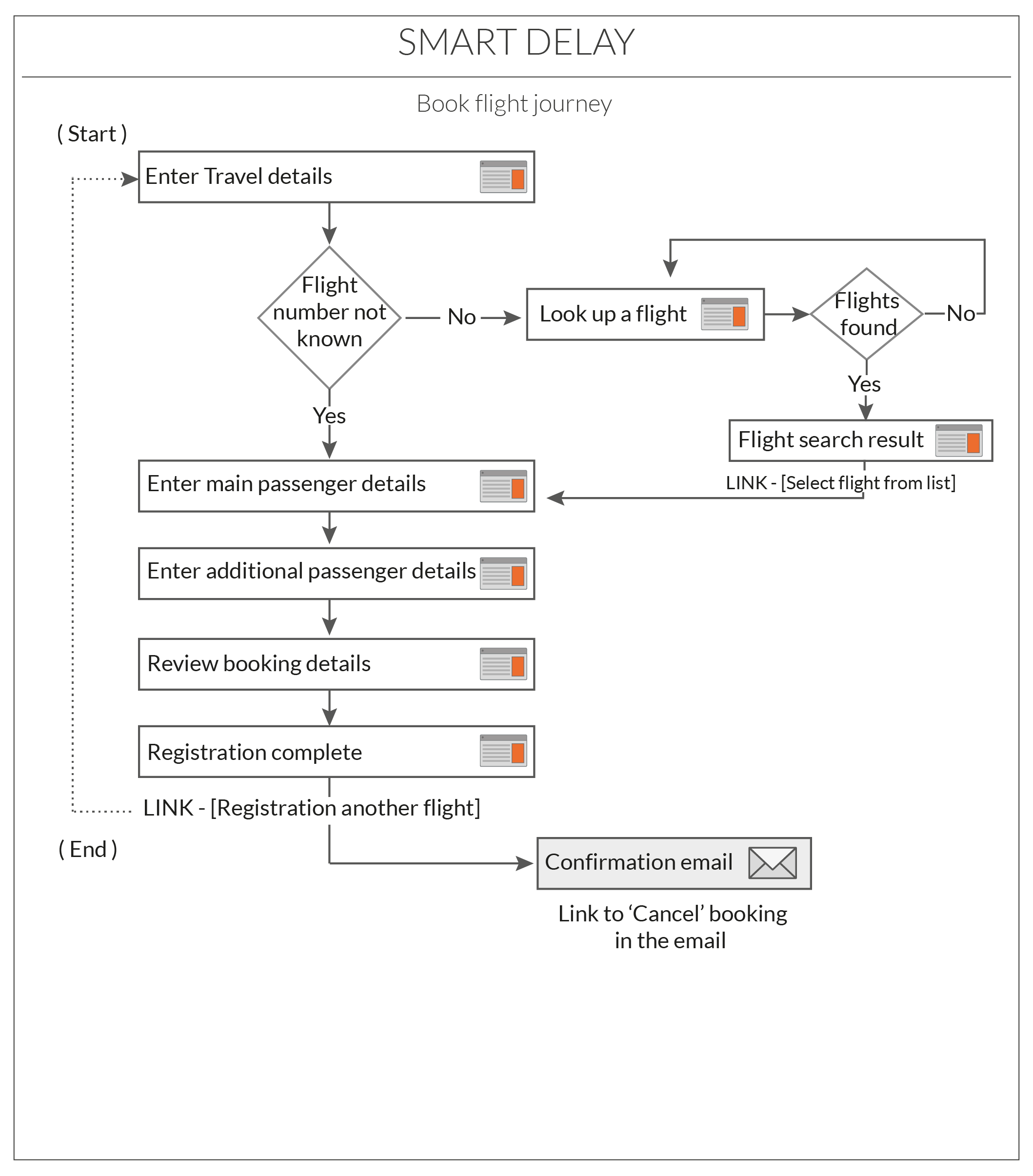
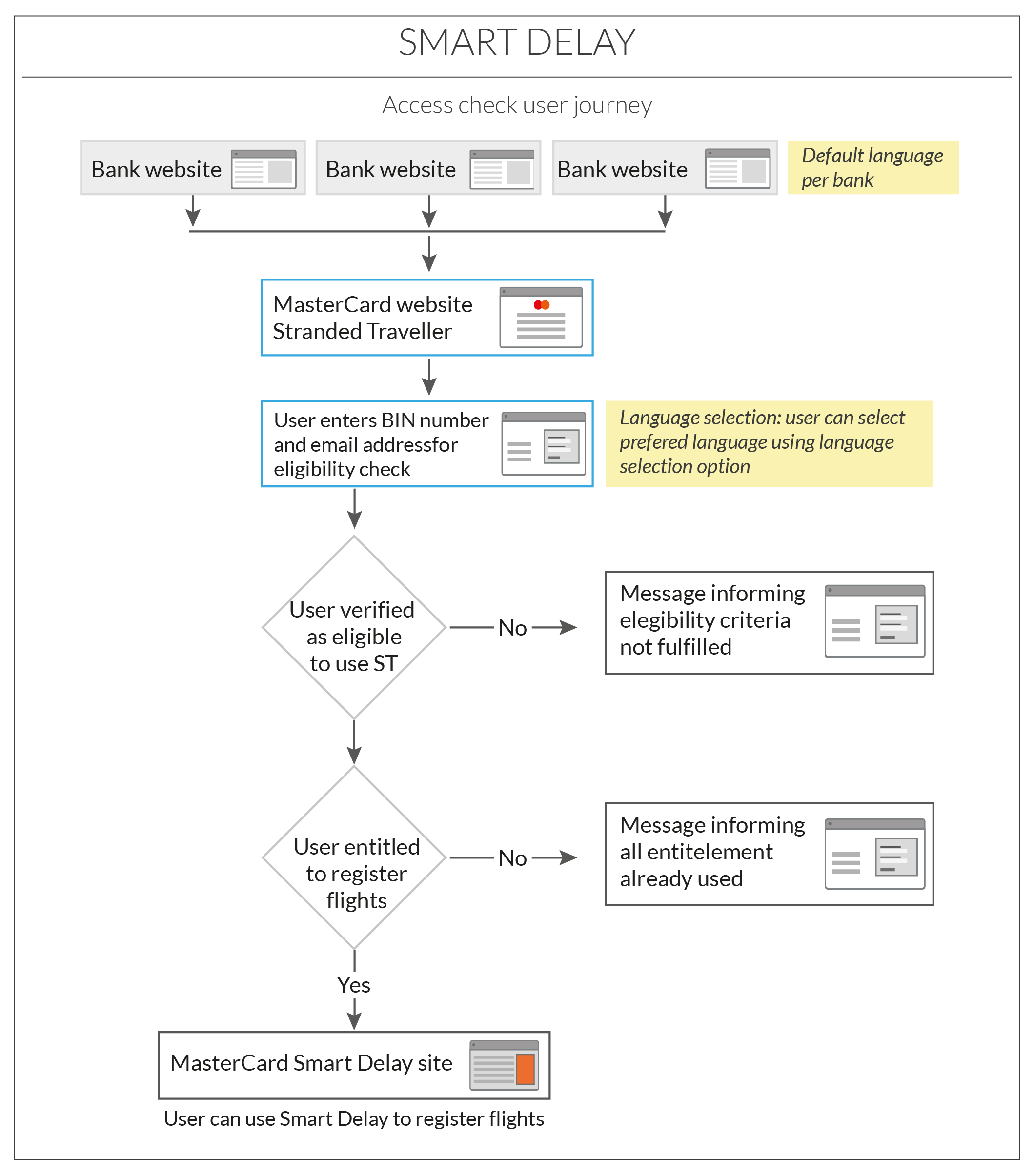
The customer journey mapping was followed by the task analysis of the different scenarios and optimising the steps needed for each task.

Rapid prototype
A click through prototype in axure was the next step in the design process. This gave the design team to run a few quick user tests to validate the user needs were addressed. This also gave the stakeholders a clear understanding of the registration widget.
Wireframes & concepts
After the click through prototype, I created the high fidelity wireframes in Sketch app. The initial approach was to align the ui to a mobile app . I created the wireframes to show full journey using a bottom menu. These wireframes were used to conduct user testing to evaluate how users were able to complete the key tasks.
The second iteration to the wireframes were made to show the interactions of the widget without the fixed menu. The rational behind dropping the fixed menu was the widget interface would be same across all devices and provide a more consistent experience to user.
DESIGNVisual design
The mobile first approach meant the visual design of the registration widget had to be simple and consistent across all devices but still easy to use. A working white lable product with Collinson branding was created to demonstrate the product facility and for B-2-B marking. The business requirement was to use styles which made the UI easy to theme for each client.
Home
Sign in
Search flight
Multi-stop flight
Add payment card
Payment Card list
Additional passengers
Review booking details
THE TAKE AWAYKey learnings
Designing a new product has its own challenges, specially during the user research stage. Though quantitive research gave us some data, it was more important to have qualitative research to understand users’ real expectations and pain points. Insights from the research stage helped me design a simple and easy to use solution.


