


SMART REDEEM
Smart Redeem Store is loyalty reward redemption solution provided by Collinson, which is used by leading brands in travel industry. This is a e-commerce platform where users can redeem their loyalty currency or points to get rewards.
THE CHALLENGERedesign the product
The stakeholders wanted the design team to create responsive screens for the existing system. The design objective was to create a more engaging solution keeping the user at the heart of the solution. Analysing the existing system using analytics and heat-maps helped me understand the bounce rate and user testing gave me a clearer picture of users engagement.
Design Goals
Mobile first approach for the entire experience
Define and enhance end to end user experience
Optimise user journey for payment with points
Design the after sales scenario
Redesign product screen for best mobile experience
Improving ‘search for product’
Create UX for user 'wish lists’
Optimise emails for mobile
APPROACHDesign strategy
The design strategy had to start with analysis of the existing system, followed by research, prototype and designing the solution while ensure we got user feedback and user testing at constant intervals.

My Role
UX research, Prototype, User testing , UX Design
Softwares
Sketch with Abstract & Invision, Adobe XD - Photoshop
DISCOVERYUnderstanding user needs
With the objective of getting an insight into users’ expectation of loyalty reward programmes, I created a survey which was sent to existing members of loyalty programmes. The key findings of the survey were:
77% of user look for programmes with more choice of rewards
Almost 1 in 2 user want a simpler user experience for redeeming loyalty points
75% of users look for loyalty programmes with more choice of rewards
76% of airline and 72% of hotel loyalty programme members look for both offline and online redemption capabilities
User persona
I interviewed some frequent users of the existing redeem site to understand they engaged with the site. I created a user persona to provide the wider team with an understanding of a typical user, their goals and pain points.
Empathy map
Though the user was expected to make a purchase, this was not a e-commerce website. I created the empathy map to document how a typical user engages with the loyalty point redeem site.
User journey map
I created the user journey map to document a typical user’s experience starting at registration to the redeeming loyalty reward points.
IDEATIONIdeas & Inspirations
Creating a inspiration board of mobile screens from leading and commonly used brand in the retail industry helped me have an idea of the best practices and the design trends in retail of luxury goods. These screens shots also helped me form a discussion around the design patterns we could use for the redesign project.
The key pages for the design were:
Search & search result
Product details
Basket
Payment pages
Order Confirmation

THE CONCEPTSite structure & wireframes
Following the user journey, I created a site structure mapped with the task flow ensuring the entire user experience of the site was documented.

Mobile first approach for header

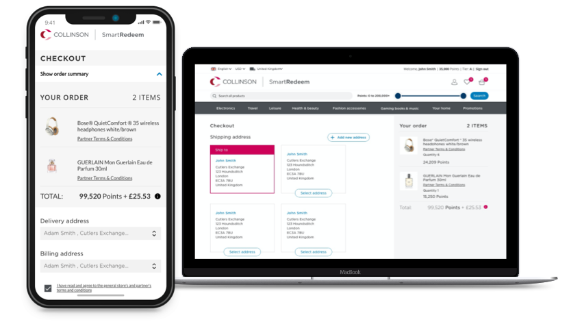
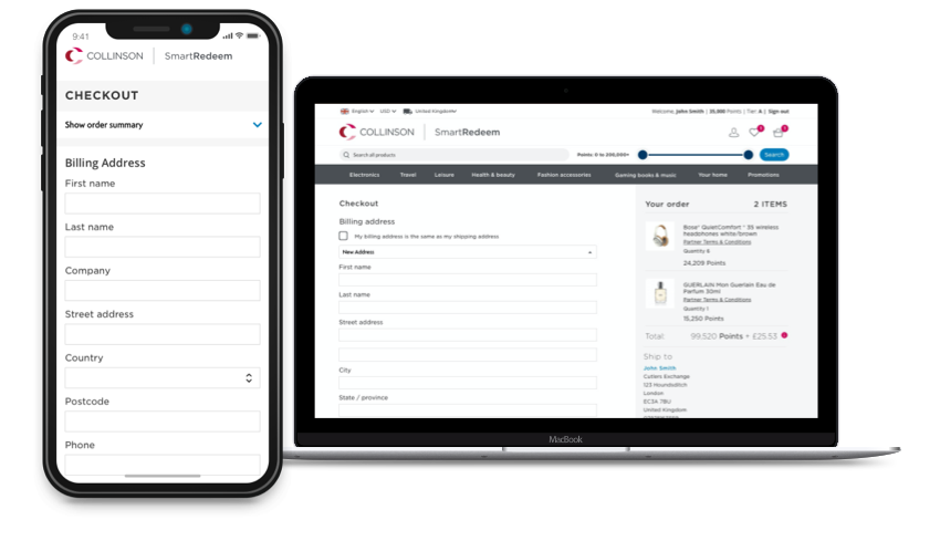
Optimising checkout
Checkout had the highest drop offs in the entire site. User research indicated the checkout journey was not optimised for mobile experience. To optimise the journey, I first mapped the existing mobile journey and analysed the screens and create patterns which

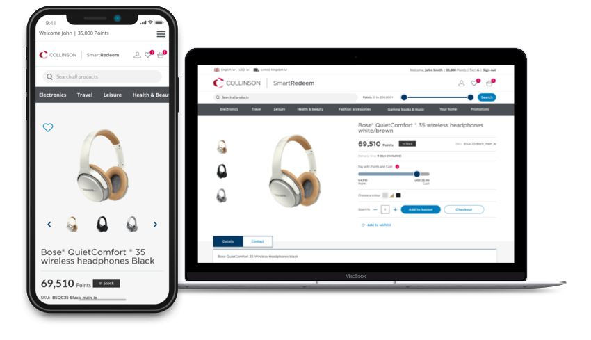
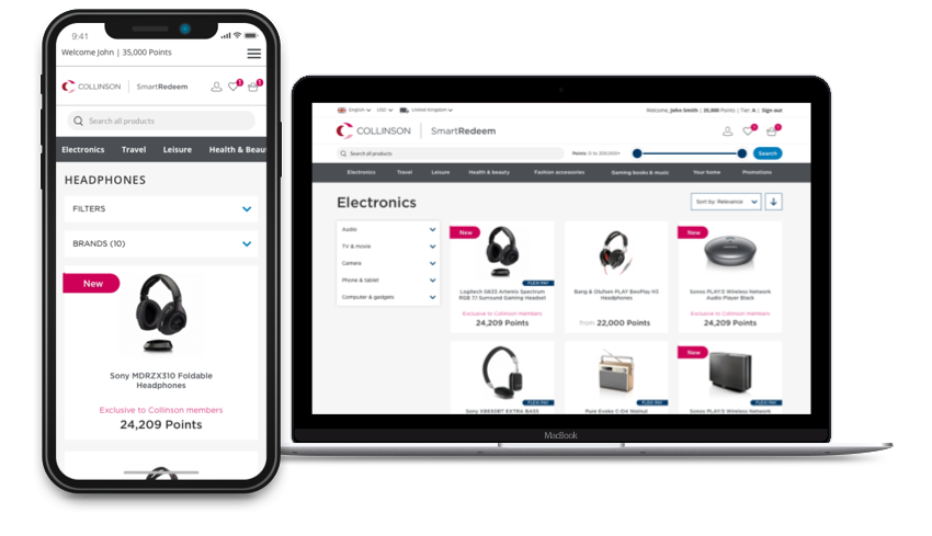
Product page
Designing with mobile first approach, the central part of the product page had had to be product image, followed by the additional details and CTAss For larger screen I followed the market standards and divided the product page into two columns: photos on the left, and product information and actions on the right. Users are already familiar with this layout and they won’t have to learn a new UI. The additional data about the product specifications needed to be grouped and ordered based on priority.

THE SOLUTIONVisual design
The visual design was a Collinson branded white lable product which was used mostly for B-2-B marketing purpose.
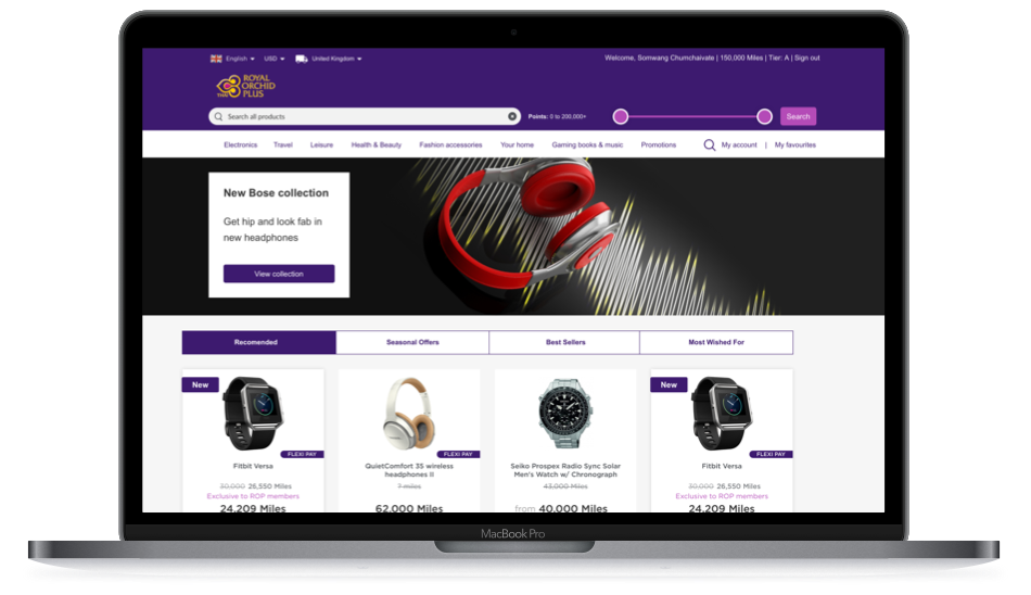
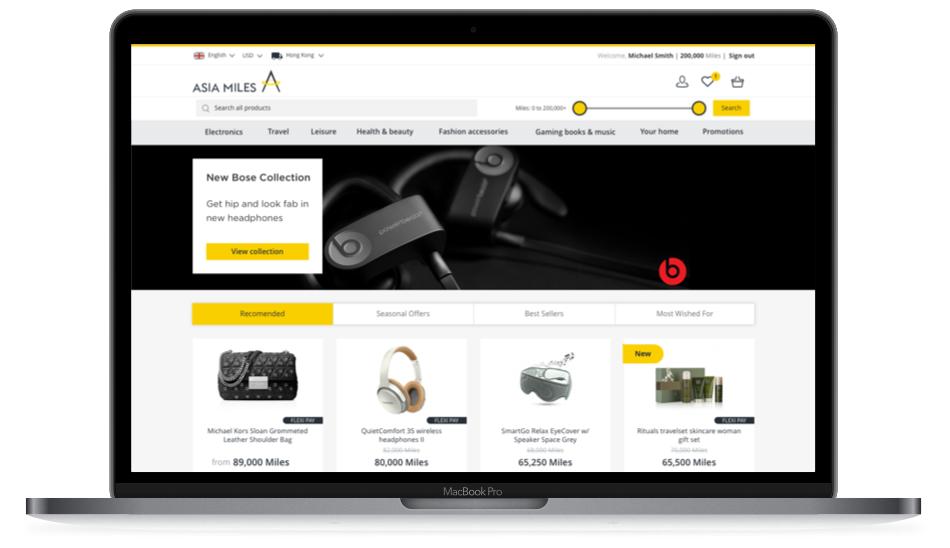
Home page

Product page

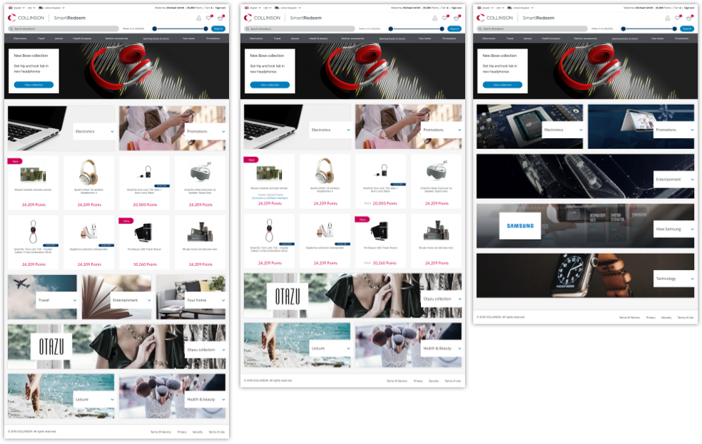
Home page design options


Outcomes
Redesigning the product experience had some very positive outcomes. There was a 22% increase in the conversion rate and the traffic to the site also increased by 30% in the first 3 months.
Usability study and user research sessions conducted over 2 days with 30 participants to understand the success of the redesign. Participants in the test were tasked with completing preassigned tasks to verify that the customer journey was smooth, that search functionality was clear, navigation between pages and the checkout process was logical. The research showed that the redesign product outperformed the previous version in all measured user experiences metrics.


